Quick answer
As corporate interior designers in Kenya, we use colour to support health by cutting glare and improving visual comfort, to protect safety because red, yellow, blue and green carry fixed safety meanings that decoration must never confuse, and to support welfare by shaping how each space feels to use. Research shows the effects are real but modest, so colour works best alongside good lighting, layout and air quality.
Colour is one of the first things people notice in a workplace, and one of the easiest to get wrong. In this article, we explore the psychology of colour, how different hues evoke specific psychological responses and how corporate interior designers in Kenya use this knowledge to create environments that support organizational objectives.
Here is what the research says, and how we use colour at Design Forty to support health, safety and welfare.
What does the research say?
A systematic review of workplace colour research by Savavibool, Gatersleben and Moorapun (2018) looked at 40 studies. It found that colour has a significant influence on mood and emotion, on wellbeing such as stress and comfort, and on performance, including productivity and creativity. e-iph
The findings aren’t one-sided, though. In the earlier conference version of the same review (2016), the authors report that the results were sometimes contradictory: cool colours reduced productivity in one study of architects’ offices but improved creativity in another, many studies used students in laboratory settings, and one real-workplace study found no effect of colour on perceived productivity. e-iph
Schatz and Bowers (2005) reached a similar conclusion in a review written for workplace designers: many commonly held beliefs about room colour are inaccurate, though careful colour selection may slightly improve productivity and employee satisfaction. ucf
So the honest summary is that colour is a modest, supporting factor, and its effects depend on the person, the task and the setting. We treat it as a way to make a space comfortable and clear, not as a way to promise higher output.
Health: colour and visual comfort
- Glare and eye strain. We use matt or satin finishes on walls and avoid high-gloss surfaces that bounce light into people’s eyes.
- Daylight. Light colours on ceilings and upper walls help daylight reach deeper into the room.
- Calm versus stimulation. Research on how warm and cool colours affect people is mixed, so we choose softer or livelier tones to suit what each space is used for and we test the palette with the people who will use it.
- Paint and air. The colour on the wall is only half the story. The paint itself matters, so we specify low-VOC products and test the air quality once the finishes are in.
- Avoid extremes. Large blocks of very bright or very dark colour can feel tiring.
2. Safety: the colours corporate interior design companies in Kenya DO NOT get to decorate with
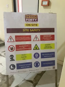
Safety colours are set by the international standards ISO 3864 and ISO 7010, so their meanings are the same worldwide:
| Colour | Meaning | Used for |
|---|---|---|
| Red | Prohibition, and firefighting equipment | “No” signs, fire extinguishers, alarm points |
| Yellow | Warning of a hazard | Hazard triangles, caution areas |
| Blue | Mandatory action | “You must” signs, such as protective equipment |
| Green | Safe condition, including exits and safety equipment | Exit signs, assembly points, first aid ISO 7010 +3 |
What this means for design:
- Keep decoration from competing with safety. Using a safety colour decoratively near where it carries a safety meaning can blur the message people rely on in an emergency. On the VIZX project, we kept a red feature wall away from the fire exit, so the exit sign stayed the first thing people see.
- Keep exit signs and fire equipment clear. This makes it easy to see against the wall colour.
- Use contrast between a darker door frame and a light wall to mark edges, steps and counter fronts for people with low vision.
- Never rely on colour alone. Some people cannot tell certain colours apart, so pair colour with shape, text and symbols.
3. Welfare: colour that makes a space feel right
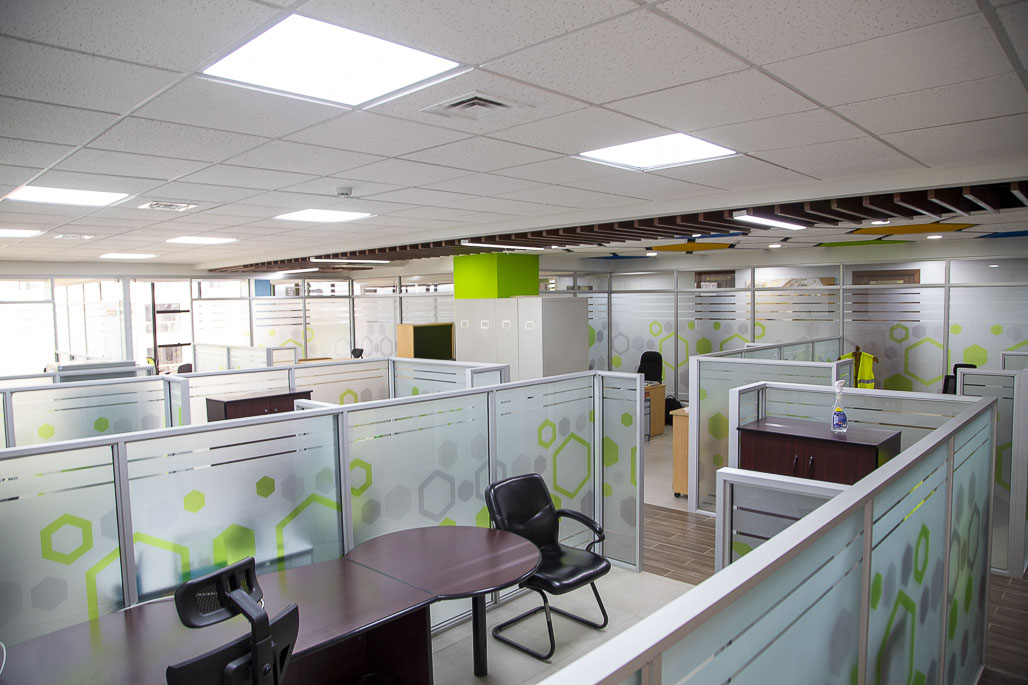
- Zone by purpose. Calm, muted tones for breakout and quiet rooms, livelier accents for collaboration areas, neutral tones for open-plan work.
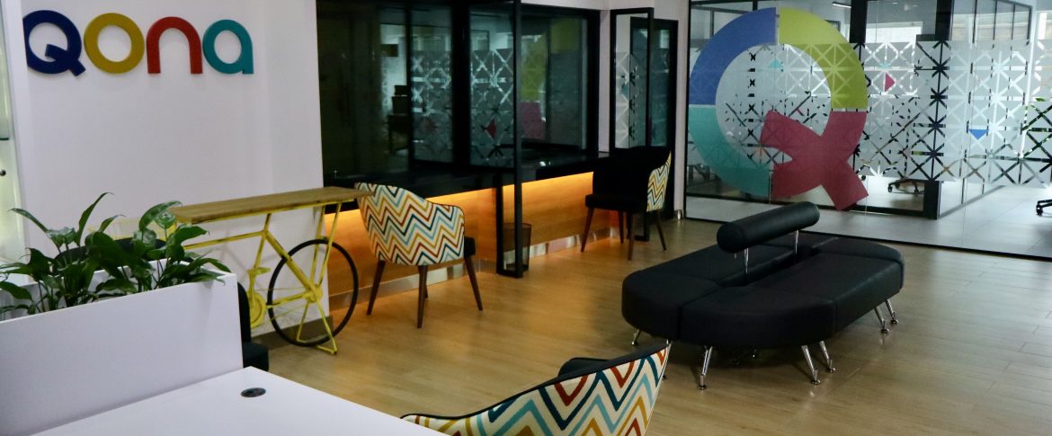
- Brand colour in small doses. A feature wall or soft furnishings add identity without overwhelming the room.
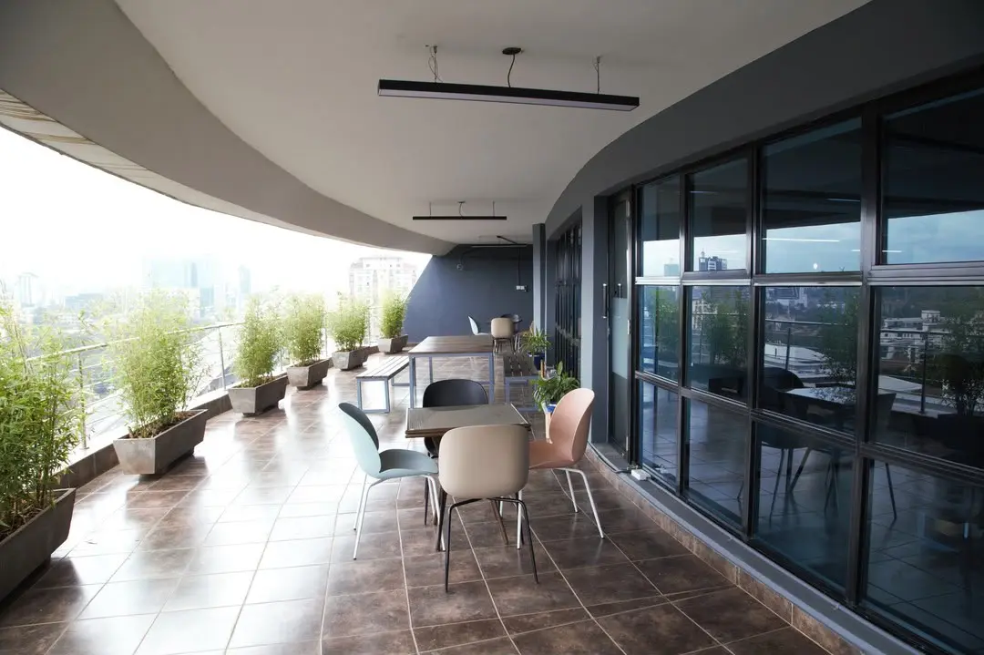
- Natural tones and plants. Greens, earthy colours and timber warmth tend to feel restful.
- Think about people. Colours carry different meanings for different people, so avoid strong choices that could exclude or distract, and consult the team who will use the space.
- Consistency in circulation. Calm, clear colour in corridors and stairs helps people move confidently and reduces confusion.
Colour by colour: what we’ve learned as one of the corporate interior design companies in Kenya
Here is how each colour behaves in a corporate space, and what to watch for.
Blue
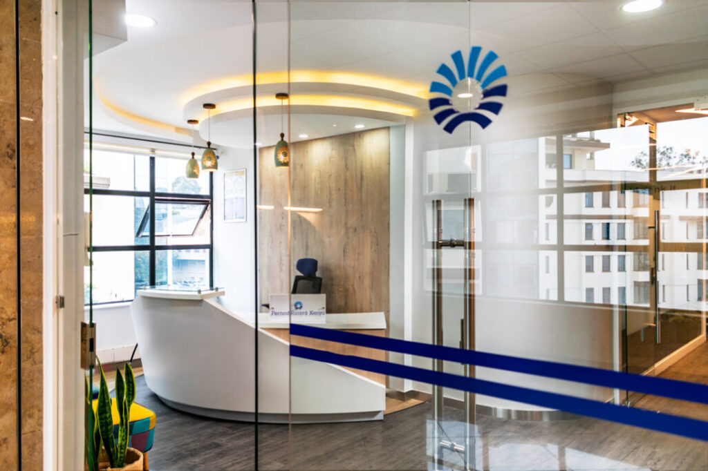
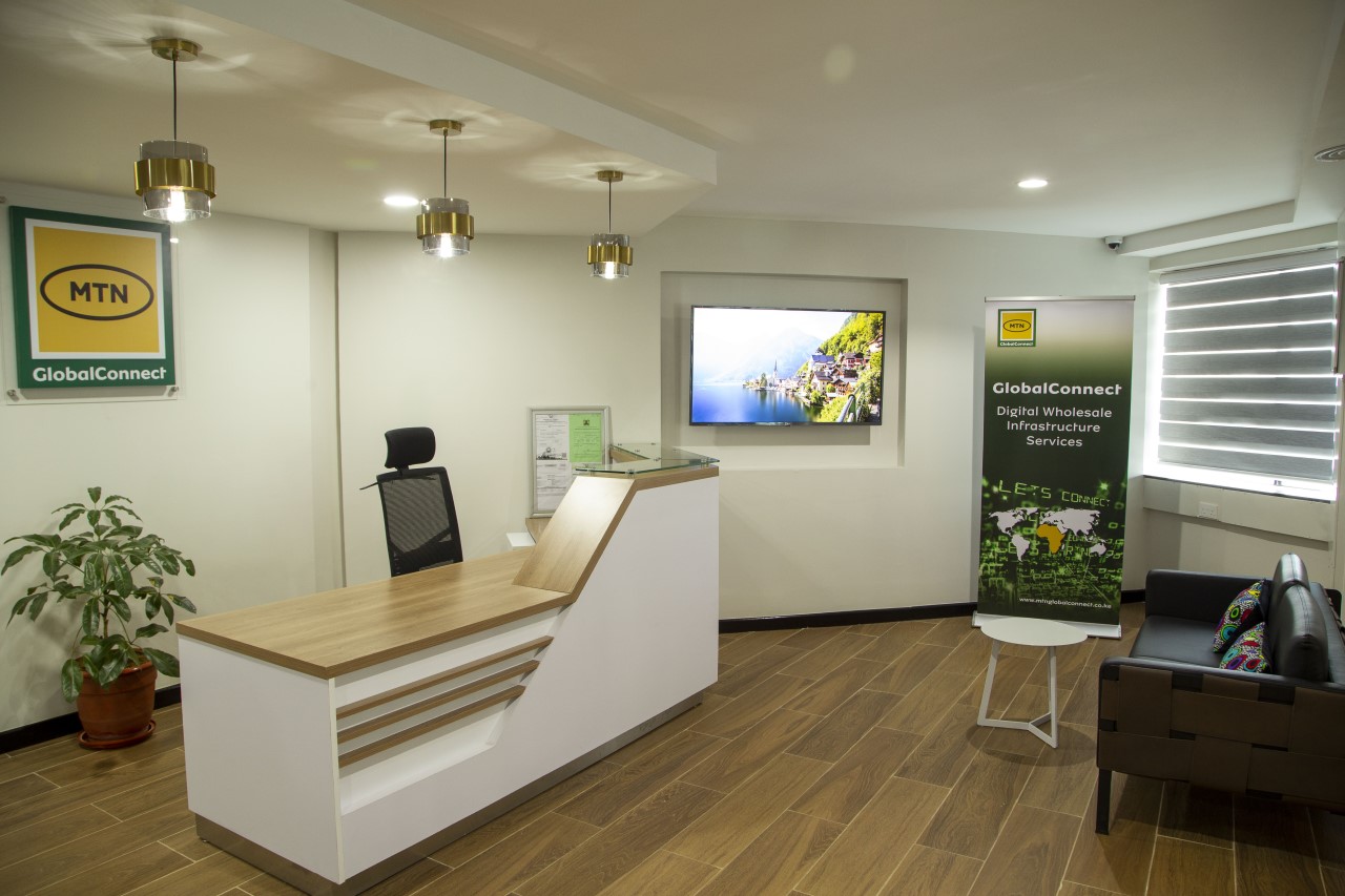
Blue creates a sense of calm and professionalism. Its presence in office settings promotes stability and reliability. This makes it ideal for fostering focus and collaboration. Blue hues instill a serene ambiance which creates a conducive environment for productivity and concentration. In corporate interior design, it is mostly used in receptions to make the visitors feel comfortable
Yellow
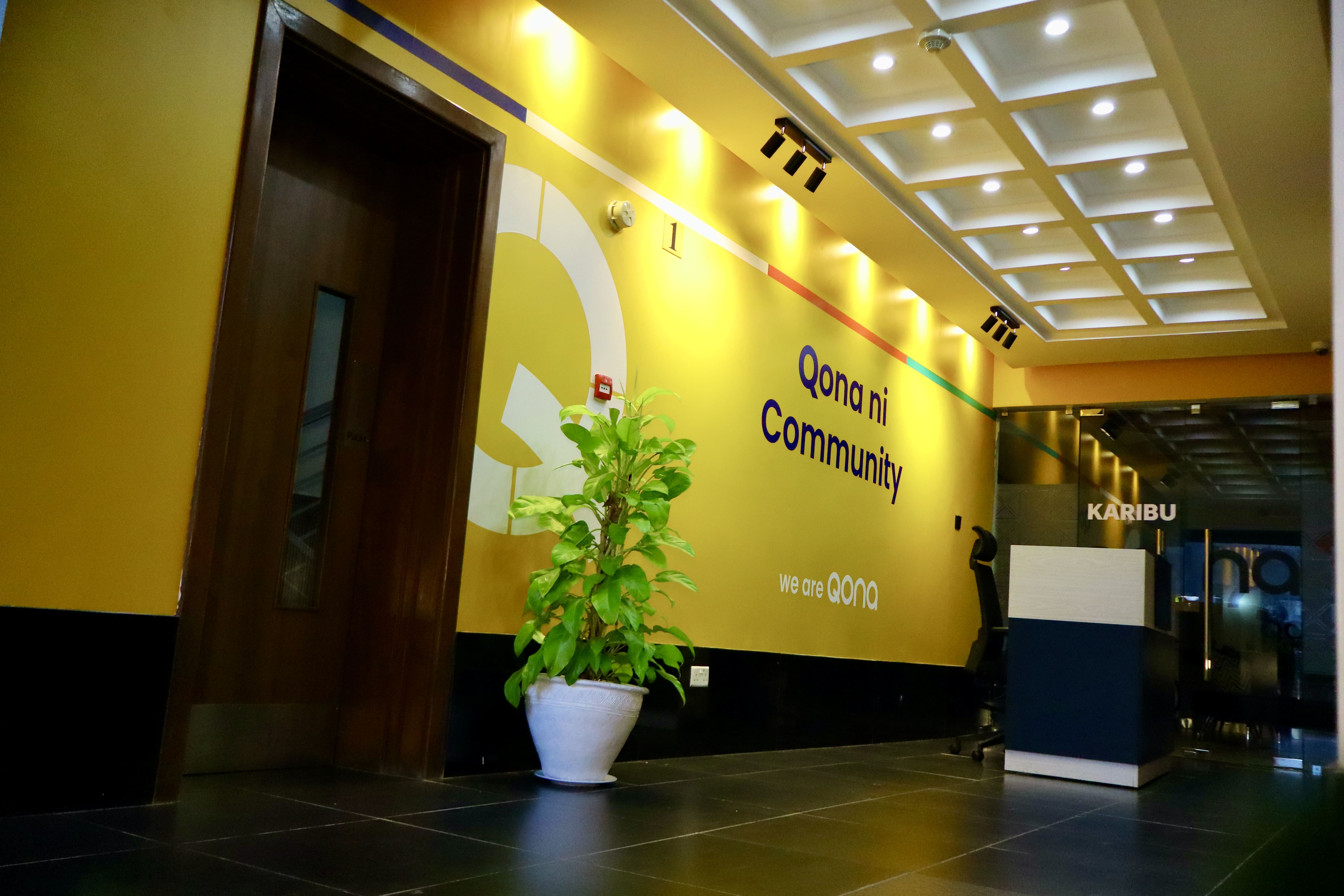
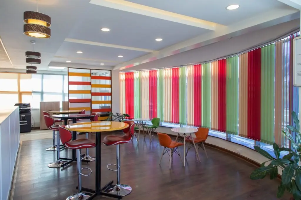
Yellow is a colour that is associated with happiness and positivity. It gives a sense of warmth thus fueling motivation and enthusiasm. It is the most attention grabbing colour on the spectrum, alongside the colours red and orange. Due to this fact, fast food restaurants employ the use of these colours to attract customers. Interior designers, however, tend to mix yellow with other colours when creating designs because too much yellow can cause agitation.
Green
Green is linked to nature and growth. In corporate interior design in Eldoret, green evokes a sense of harmony and well-being, fostering a connection of the occupants to the natural world. Green is often used in office settings to create a rejuvenating environment that reduces stress and promotes creativity. Additionally, green accents can enhance the perception of sustainability and environmental consciousness within the organisation.
Neutral Tones
Neutral tones include colours like beige, taupe, peach, grey, cream and brown. They are often used for walls, floors and larger furniture pieces in corporate interior design, providing a balanced canvas that allows other elements to shine. They are also very ideal for creating a neutral backdrop that complements a wide range of accent colours and design styles.
Orange
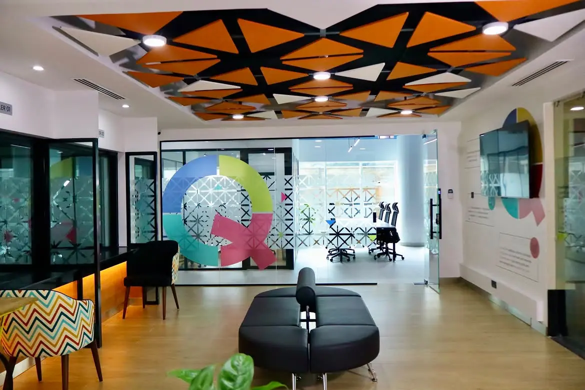
Orange exudes warmth, enthusiasm and creativity. In corporate interior design, orange is used to introduce energy and vibrancy into the space. This makes the atmosphere engaging.. Orange is often used in collaborative areas or breakout spaces to encourage interaction and brainstorming among employees. However, like yellow, orange should be used in moderation to avoid overwhelming occupants, particularly in areas where concentration is required.
Black
Black is a colour that represents elegance, power and sophistication. Due to this fact, furniture fittings of executive offices and areas like the boardroom, often have a hint of black alongside neutral colours. It is used minimally to ensure there is visual balance.
White
White is a symbol of purity, simplicity and clarity. In corporate interior design, white is often used to create an atmosphere of cleanliness and spaciousness. White walls and furniture can make a space feel open and airy. This brings about a sense of calmness. Additionally, white reflects light, making it an excellent choice for enhancing natural or artificial lighting in the workspace.
Purple
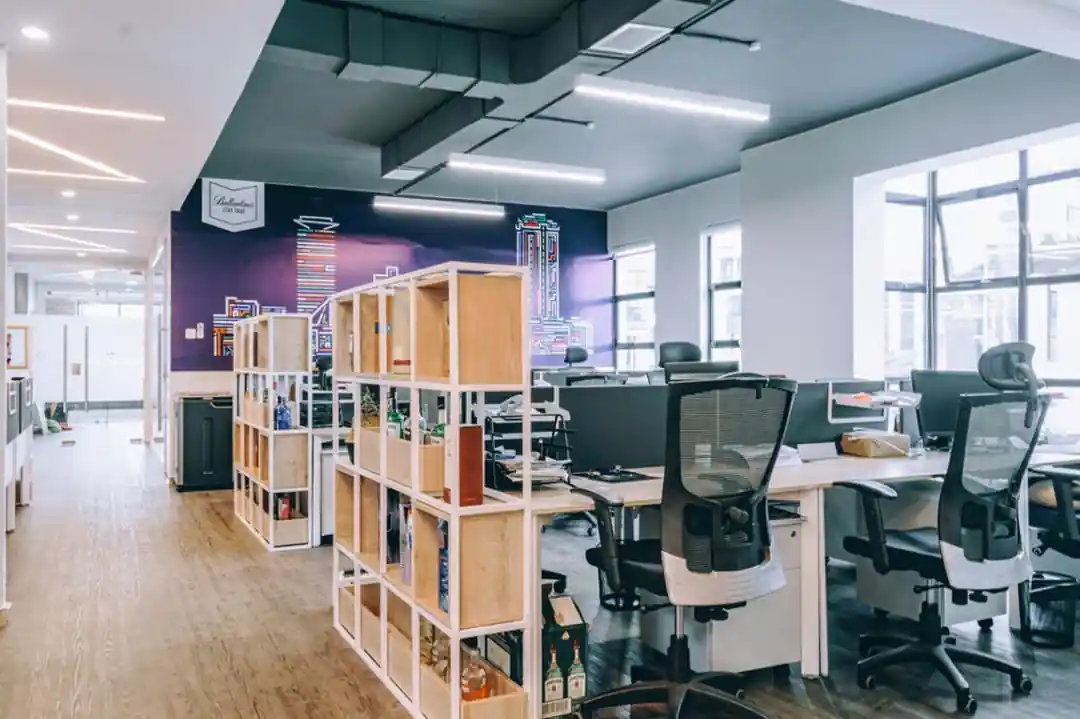
In corporate interior design in Kenya, shades of purple can add a sense of opulence and inspiration to the environment. Used sparingly as an accent colour or in combination with neutral tones, purple can evoke a sense of creativity and innovation . This makes it suitable for spaces where brainstorming and ideation occur.
Red
Red is associated with energy and passion. In corporate interiors, it is used in areas where action is desired such as meeting rooms, breakout areas and receptions.
Different colours used for safety in a construction site
How corporate interior designers in Kenya choose a colour palette
We start with how each zone will be used, then the daylight it gets, then the brand and only then the swatches. A short checklist we run through on every project:
- What will people do in this space and for how long?
- How much daylight does it get and from which direction?
- Where are the exits, fire equipment and signage and does the palette keep them dominant?
- Does the brand colour belong here or in smaller doses?
- Are the finishes matt or satin, and low in VOCs?
- Does anything rely on colour alone to be understood?
FAQs about colour in corporate interior design
Does colour affect productivity?
Research suggests colour can have a small effect on mood and satisfaction but results vary and many popular claims are overstated. We use colour to make a space comfortable and clear, not to promise a productivity increase.
What colours are best for an office?
Light neutrals suit most walls and ceilings, with muted natural tones in rest areas and one or two brand accents. The best palette depends on the daylight, the use of each zone and the people who work there.
Can I paint my office any colour?
Yes, with one rule: keep decorative colours from competing with safety signs and fire equipment, particularly red, yellow, blue and green.
What colours are used for safety signs?
Red marks prohibitions and fire equipment, yellow marks warnings, blue marks mandatory actions, and green marks safe conditions and exits.
Does paint colour affect air quality?
No. The paint’s formulation does. Choose low-VOC paints and check the air once the finishes are in.
| Zone | Colour approach | Health, safety and welfare purpose |
|---|---|---|
| Reception | Warm neutrals with a brand accent | Welcoming first impression; clear contrast at doors and signage |
| Open-plan office | Light, neutral walls; limited accents | Reflects daylight, reduces glare, avoids visual overload |
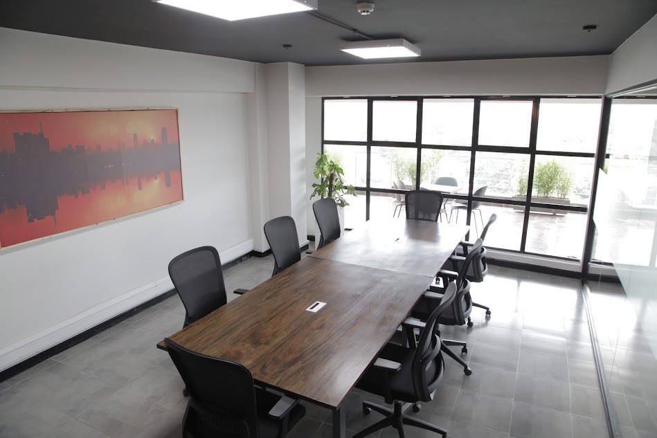
| Meeting rooms | Soft, mid-tone colours | Comfortable for long sessions; supports focus |
| Breakout area | Muted warm or natural tones, plants | Calm, restful, different from the work floor |
| Focus or quiet room | Cool, soft, low-contrast | Supports concentration and rest |
| Corridors and exits | Light, clear, with high-contrast edges | Easy wayfinding; exit signs stay dominant |
In conclusion, the strategic application of colour psychology in corporate interior design companies in Kenya really enhances the overall functionality and atmosphere of a space. By considering the psychological impact of colour on occupants, designers can tailor the design to support specific activities and workflows, ultimately optimising the performance and satisfaction of individuals within the space.
Used well, colour supports health by easing visual strain, safety by keeping exits and fire equipment unmistakable, and welfare by making each space feel right for its purpose. As corporate interior designers in Kenya, that’s how we approach every palette. Planning an office fit-out or refresh? Reach out to us today!
Sources
- Savavibool, N., Gatersleben, B., & Moorapun, C. (2018). The effects of colour in work environment: A systematic review. Asian Journal of Behavioural Studies, 3(13), 149–160. https://doi.org/10.21834/ajbes.v3i13.152
- Savavibool, N., Gatersleben, B., & Moorapun, C. (2016). The effects of colour in work environment: A systematic review. Environment-Behaviour Proceedings Journal, 1(4), 262–270. https://doi.org/10.21834/e-bpj.v1i4.167
- Schatz, S. L., & Bowers, C. A. (2005). 10 questions on room color: Answers for workplace designers. Ergonomics in Design, 13(4), 21–27. https://doi.org/10.1177/106480460501300406
- International Organization for Standardization. ISO 3864 (safety colours and safety signs) and ISO 7010 (registered safety signs).
- Studio Matrx. Colour safety and coding standards.
Leave A Comment