Colour Psychology in Corporate Interior design
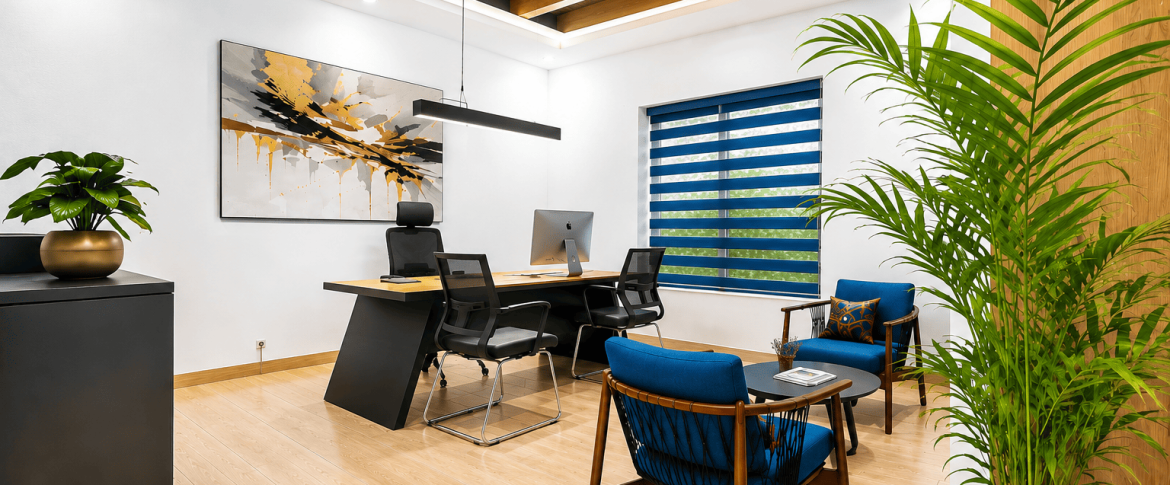
In corporate interior design, aside from colour being a visual attribute, it is a very important and powerful tool that influences behaviour, emotion and perception. The strategic use of colour can shape the ambiance and productivity of a space. This article explores the psychology of colour, exploring how different hues evoke specific psychological responses and how corporate interior designers in Kenya use this knowledge to create environments that support organisational objectives
Red
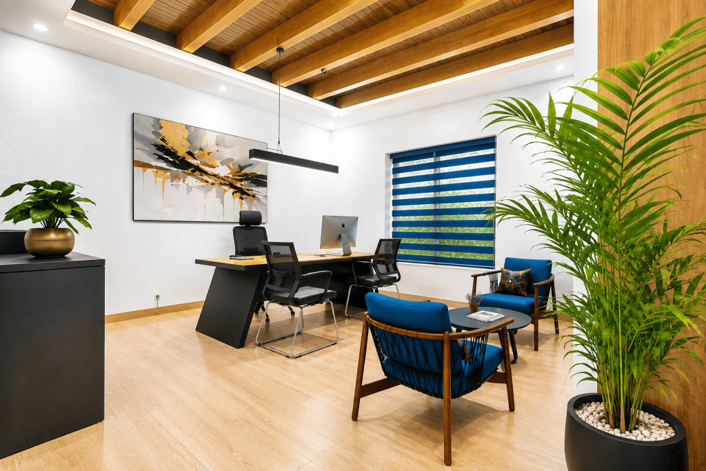
Blue creates a sense of calm and professionalism. Its presence in office settings promotes stability and reliability. This makes it ideal for fostering focus and collaboration. Blue hues instill a serene ambiance which creates a conducive environment for productivity and concentration. In corporate interior design, it is mostly used in receptions to make the visitors feel comfortable.
Yellow
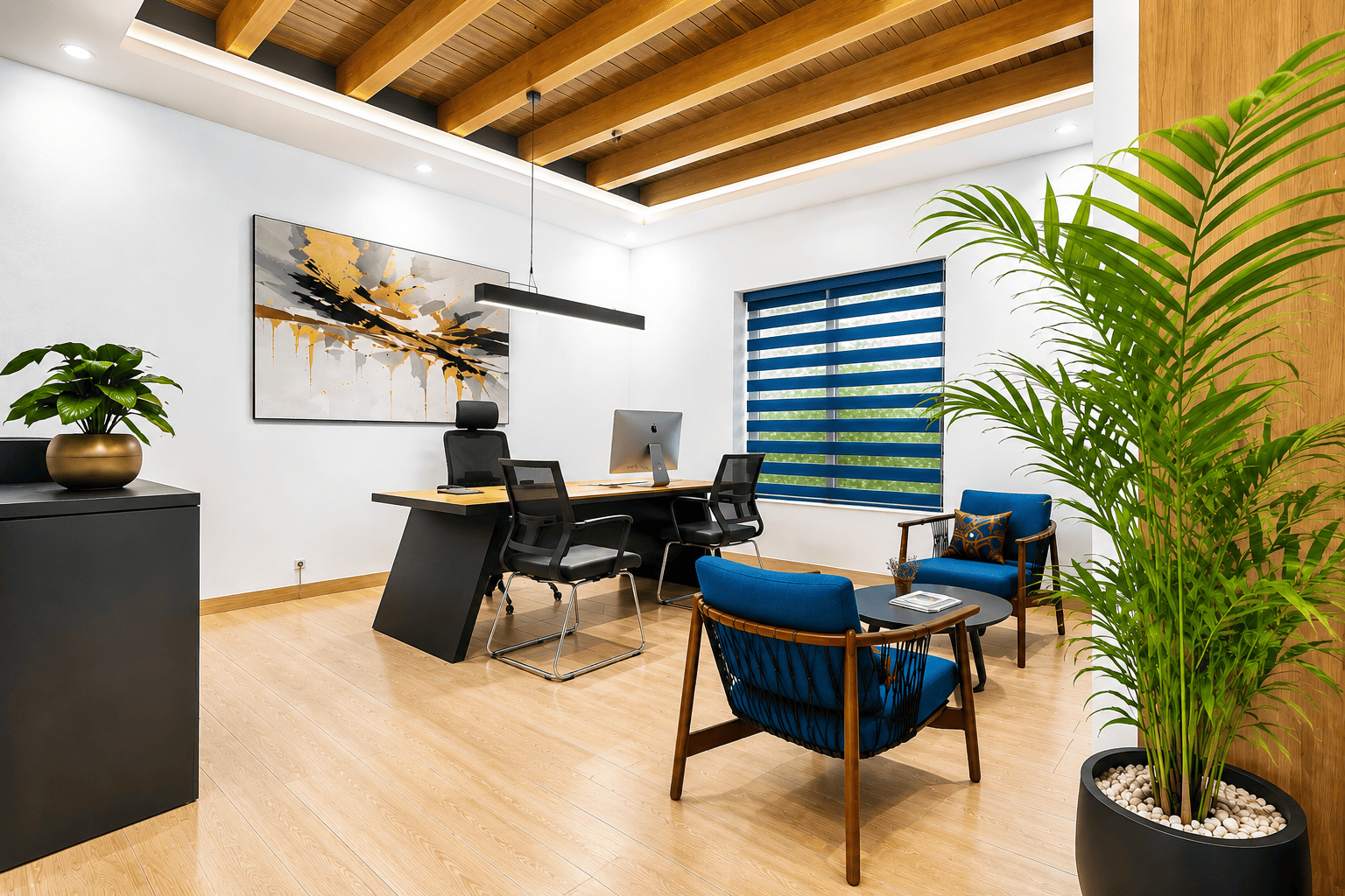
Yellow is a colour that is associated with happiness and positivity. It gives a sense of warmth thus fueling motivation and enthusiasm. It is the most attention grabbing colour on the spectrum, alongside the colours red and orange. Due to this fact, fast food restaurants employ the use of these colours to attract customers. Interior designers, however, tend to mix yellow with other colours when creating designs because too much yellow can cause agitation
Leave A Comment