COLOUR PSYCHOLOGY IN CORPORATE INTERIOR DESIGN
COLOUR PSYCHOLOGY IN CORPORATE INTERIOR DESIGN
In corporate interior design, aside from colour being a visual attribute, it is a very important and powerful tool that influences behaviour, emotion and perception. The strategic use of colour can shape the ambiance and productivity of a space. This article explores the psychology of colour, exploring how different hues evoke specific psychological responses and how corporate interior designers in Kenya use this knowledge to create environments that support organisational objectives.
Blue
Blue creates a sense of calm and professionalism. Its presence in office settings promotes stability and reliability. This makes it ideal for fostering focus and collaboration. Blue hues instill a serene ambiance which creates a conducive environment for productivity and concentration. In corporate interior design, it is mostly used in receptions to make the visitors feel comfortable.
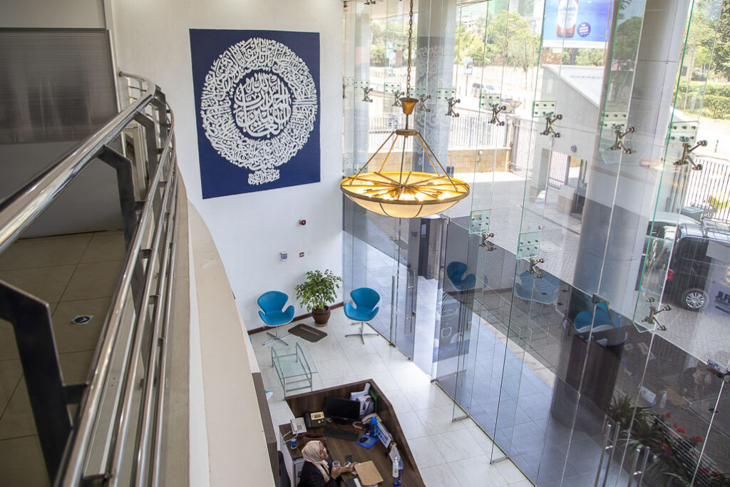
Blue hues used at Takaful reception, designed by Design Forty Ltd.
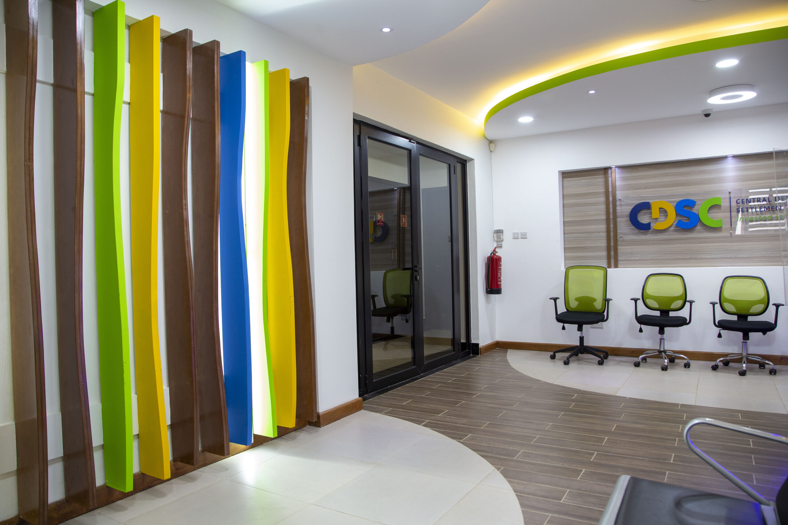
Yellow
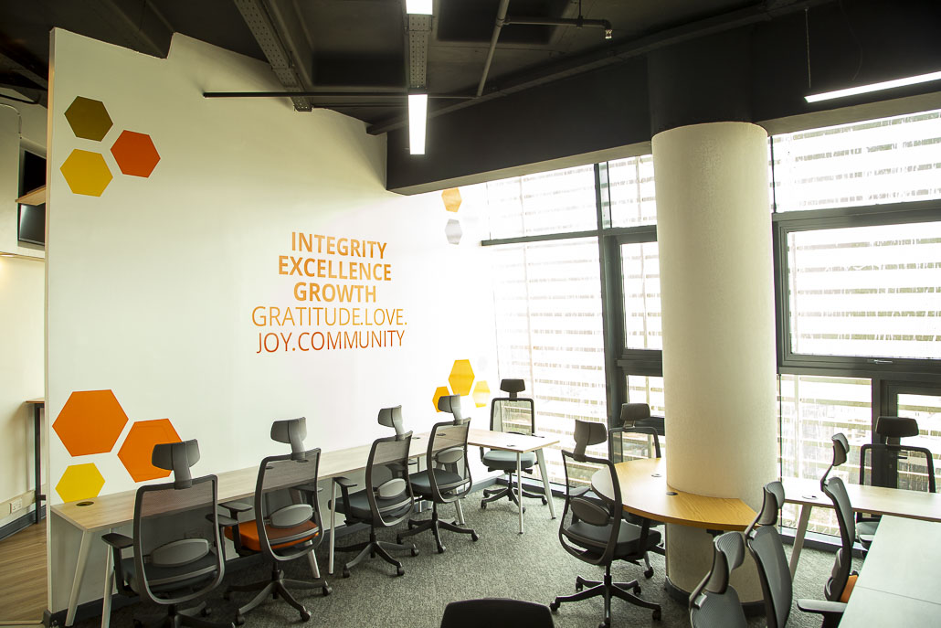
Yellow is a colour that is associated with happiness and positivity. It gives a sense of warmth thus fueling motivation and enthusiasm. It is the most attention grabbing colour on the spectrum, alongside the colours red and orange. Due to this fact, fast food restaurants employ the use of these colours to attract customers. Interior designers, however, tend to mix yellow with other colours when creating designs because too much yellow can cause agitation.
Yellow hues used in fixtures and lighting to make the space vibrant.
Green
Green is linked to nature and growth. In corporate interior design, green evokes a sense of harmony and well-being, fostering a connection of the occupants to the natural world. Green is often used in office settings to create a rejuvenating environment that reduces stress and promotes creativity. Additionally, green accents can enhance the perception of sustainability and environmental consciousness within the organisation.
Shades of green on the furniture and plants create a sense of the natural environment.
Neutral Tones
Neutral tones include colours like beige, taupe, peach, grey, cream and brown. They are often used for walls, floors and larger furniture pieces in corporate interior design, providing a balanced canvas that allows other elements to shine. They are also very ideal for creating a neutral backdrop that complements a wide range of accent colours and design styles.
Neutral tones give the office sophistication.
Orange
Orange exudes warmth, enthusiasm and creativity. In corporate interior design, orange is used to introduce energy and vibrancy into the space. This makes the atmosphere engaging.. Orange is often used in collaborative areas or breakout spaces to encourage interaction and brainstorming among employees. However, like yellow, orange should be used in moderation to avoid overwhelming occupants, particularly in areas where concentration is required.
Minimal shades of orange used to make the space feel warm and vibrant.
Black
Black is a colour that represents elegance, power and sophistication. Due to this fact, furniture fittings of executive offices and areas like the boardroom, often have a hint of black alongside neutral colours. It is used minimally to ensure there is visual balance.
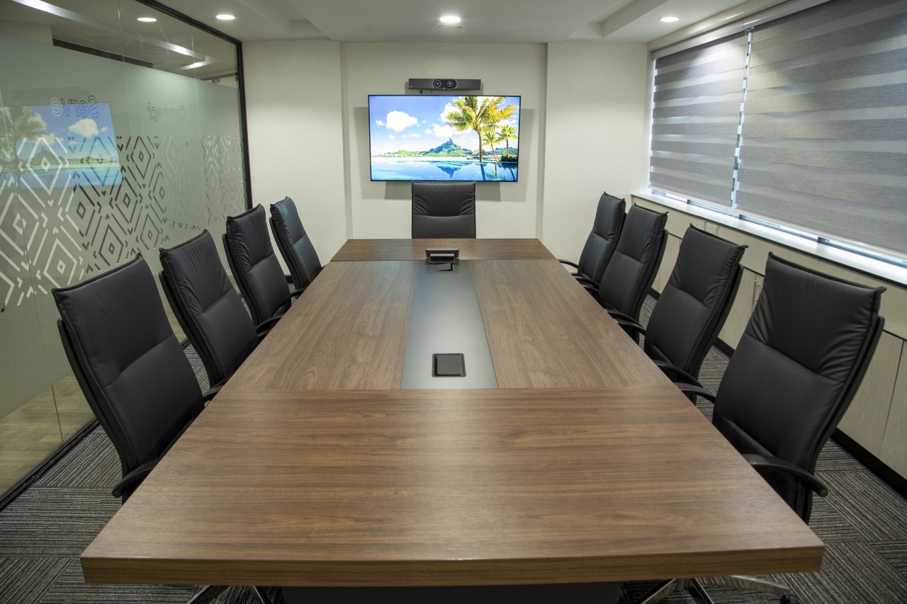
Black seats used in a boardroom to give a sense of elegance and sophistication.
White
White is a symbol of purity, simplicity and clarity. In corporate interior design, white is often used to create an atmosphere of cleanliness and spaciousness. White walls and furniture can make a space feel open and airy. This brings about a sense of calmness. Additionally, white reflects light, making it an excellent choice for enhancing natural or artificial lighting in the workspace.
White walls and white artificial lights used in a space to make it feel airy and simple.
Purple
In corporate interior design, shades of purple can add a sense of opulence and inspiration to the environment. Used sparingly as an accent colour or in combination with neutral tones, purple can evoke a sense of creativity and innovation . This makes it suitable for spaces where brainstorming and ideation occur.
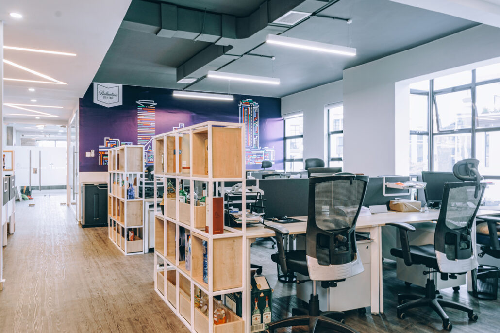
The purple wall invokes a sense of creativity and innovation.
Red
Red is associated with energy and passion. In corporate interiors, it is used in areas where action is desired such as meeting rooms, breakout areas and receptions.
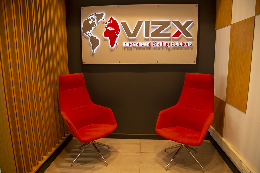
VIZX waiting area with hues of red, designed by Design Forty Ltd.
In conclusion, the strategic application of colour psychology in corporate interior design really enhances the overall functionality and atmosphere of a space. By considering the psychological impact of colour on occupants, designers can tailor the design to support specific activities and workflows, ultimately optimising the performance and satisfaction of individuals within the space. Here at Design Forty, we ensure to employ and put this fact into practice. Let us know what you think.
You must be logged in to post a comment.